Designing the DCC Club Membership Experience from Scratch
Hi! I’m Nilesh, the sole product designer behind the brand-new DCC Club Membership experience, which is a complete feature launch built from the ground up inside the DCC mobile app. This case study captures how I designed a complete membership experience from scratch.

The Problem
Inefficient Workflows:
Manual data entry through long, fixed forms slowed down veterinarians during consultations.Lack of Integration:
Disconnected invoicing, lab reports, and prescriptions led to duplicated efforts and operational delays.No Flexibility:
Doctors couldn’t customise records to match their workflow, leading to frustration.Collaboration Issues:
No system for managing multiple users accessing/editing records.Poor Access to Historical Data:
Timeline and past medical records were hard to navigate, reducing care efficiency.
My Role
Owned the end-to-end design process.
Conducted competitor analysis (Notion, Google Docs, Excel) to inspire flexible, modular design.
Led user research through interviews with veterinarians and stakeholders.
Created wireframes, prototypes, and high-fidelity UI in Figma.
Delivered detailed specs to developers via Jira and Notion.
Collaborated with PMS and devs to resolve implementation challenges.
Conducted design reviews and iterations based on feedback.
Design Process
1. Discovery & Research
Identified pain points through direct interviews with doctors, paravets, and admin staff.
Mapped workflows to uncover inefficiencies in the existing MR system.
2. Competitor Benchmarking
Studied flexible documentation tools to design a modular editor that balances freedom with medical structure.
3. Ideation & Wireframing
Explored multiple design directions to address customisation, integration, and ease of use.
4. Prototyping & Testing
Developed interactive prototypes and validated them with end-users.
4. Collaboration & Delivery
Provided developers with component libraries and design guidelines.
Supported implementation through ongoing reviews.
My Role
As the only designer, I handled:
User research
Wireframes and flows
UI design
Created celebratory and micro-interaction animations using Lottie.
Building the design system
Prototyping
Dev handoff and review cycles
Tools Used
As the only designer, I handled:
Figma for design and prototyping
Lottie for animations
Vet360 SaaS for analytics and tracking
The Challenge
While the DCC app already had loyal users booking vet consults and grooming services, we noticed repeated user behaviour, people asking for frequent discounts or trying to negotiate packages.
We asked: What if we could turn that interest into a formal membership experience that rewards loyalty and builds retention?
Live Chat Support Challenge
Many users had questions even after purchasing a plan, especially around bookings, benefit usage, and redemption processes. Our user interviews showed a recurring pain point:
I wish I could just ask someone instead of going through all these screens.
Design Goal: How might we give users quick, personalized support without making them leave the app?
Business Goal
Launch a completely new membership feature to:
Increase user retention and engagement
Boost app revenue through recurring plans
Make coupon redemption easier and trackable
Project Goals
Launch a 3-tier membership system inside the app
Educate users on the value of membership before purchase
Educate users on the value of membership before purchase
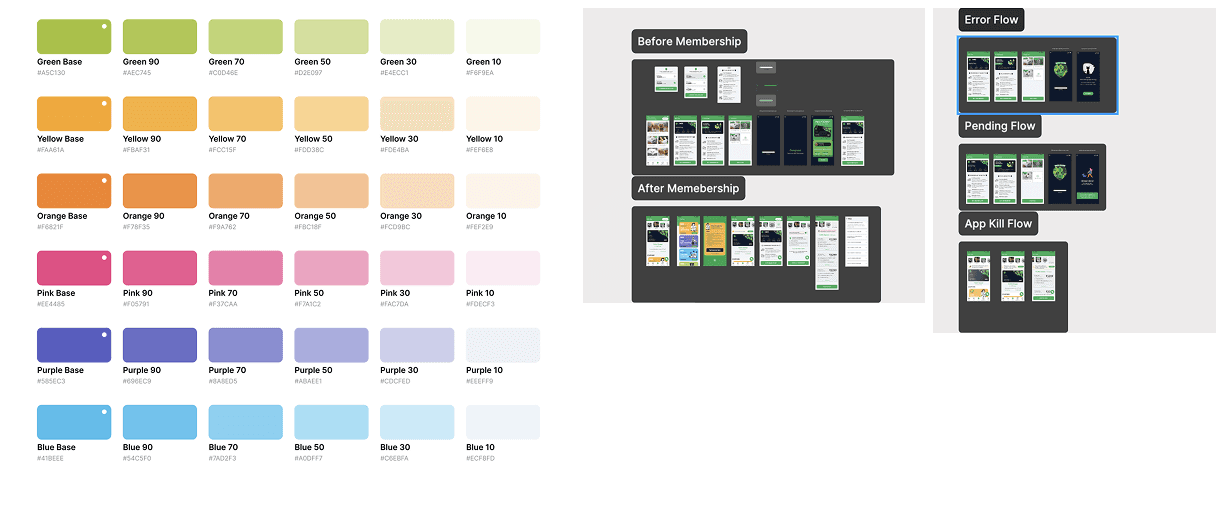
Ensure loading, error, and app-kill states are handled gracefully
Introduce in-app chat support for active members
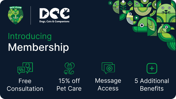
Membership Tiers
3 Months | ₹1299 | Free consultation + small discounts |
6 Months | ₹2299 | Everything in 3 Months + Adds grooming + bath/dry |
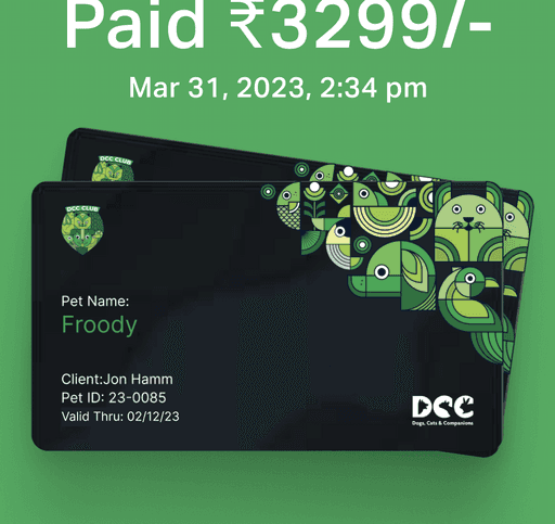
6 Months | ₹3299 | Everything in 6 Months + Best value, more benefits |
Discovery & Research
User Interviews
We spoke to 8 active pet parents and surveyed 230 users on what they expect from a paid membership.
Key Findings:
Do you have any discounts?
What if I visit regularly for any coupons or discounts?
Any discount for taking multiple services?
I forgot what I paid for?
Where do I find the benefits again?
I didn't know when it was expiring.
Competitive Analysis
I studied membership experiences from:
Zomato Pro
Cult.fit
And some more brand memberships, but not technical ones
Heads Up For Tails
This helped identify best practices around tier visibility, redemption flows, and auto-renew nudges.
Core Benefits
Free consultations
Coupon redemptions
Discounted grooming & pharmacy
Auto-renew or manual renewal
In-app member-only chat for fast support
Understanding Our Users
To ensure the membership experience worked for real pet parents, I developed personas based on user interviews and survey data. Here are two representative users who guided key UX decisions:
Persona 1: Sneha, The Urban Pet Mom
Age: 32
Location: Delhi
Profession: Marketing Manager
Pet: Labrador named Bruno
Tech Comfort: High (uses multiple apps for food delivery, health, shopping)
Membership Plan Chosen: 12-Month Premium
Behavior:
Books monthly grooming and vet consults for Bruno.
Follows DCC on Instagram and often checks for offers.
Pain Points:
Finds it frustrating to re-enter information every time she books a service.
I used to forget which coupons I had or what was covered under my plan.
Goals:
Wants convenience and clear visibility of what she’s getting.
Needs quick ways to book appointments and redeem benefits.
How DCC Membership Solves for Sneha:
A personalized dashboard showing savings, remaining coupons, and pet details.
Auto-renew reminders and a clear upgrade pathway.
In-app chat support lets her get help without calling.
Persona 2: Rajeev, The Value Hunter
Age: 38
Location: Jaipur
Profession: School Teacher
Pet: Indie dog named Shiro
Tech Comfort: Moderate (uses WhatsApp, YouTube, and Flipkart)
Membership Plan Chosen: 6-Month Mid-Tier
Behavior:
Shops carefully and compares prices before making decisions.
Look for offers on every booking.
Visits the vet at least once a month.
Pain Points:
I don’t always know what’s included in the membership.
Has limited trust in online platforms, often double-checks everything.
Goals:
Needs reassurance that his money is well spent.
Wants reminders and easy-to-use benefits without confusion.
How DCC Membership Solves for Rajeev:
Visual layout of plans makes it easy to choose the right one.
Savings tracker builds emotional trust over time.
FAQS and a coupon list reduce dependency on support calls.
Competitive Analysis
I studied membership experiences from:
Zomato Pro
Cult.fit
And some more brand memberships, but not technical ones
Heads Up For Tails
This helped identify best practices around tier visibility, redemption flows, and auto-renew nudges.
Design System
To maintain consistency across 43+ screens, I created:
Button libraries (CTA, secondary, ghost)
Card modules for coupons
Membership plan comparison tables
Skeleton loaders and empty states
Animated assets via Lottie
Experience Design Flow
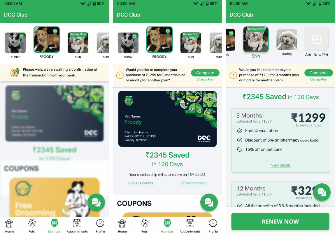
Home Screen with Membership Icon
The membership icon now appears front-and-centre
Visible pet avatar, with benefits preview
Benefits Overview
All benefits are listed with simple icons
CTA:
Buy Membership
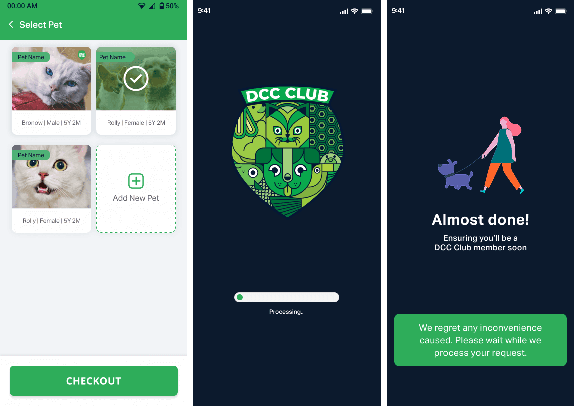
Plan Selection
Choose from 3-month, 6-month, 12-month plans
Estimated savings are shown dynamically
Auto-renew toggle option
Confirmation and Loading
Membership activated screen
Fun animation celebrates success
Skeleton loaders mimic final UI during wait times
The Experience Screen by Screen (Part 1)
01. Membership Entry Point
Added a centre CTA on Home with a pet-themed design, guiding users to explore membership.
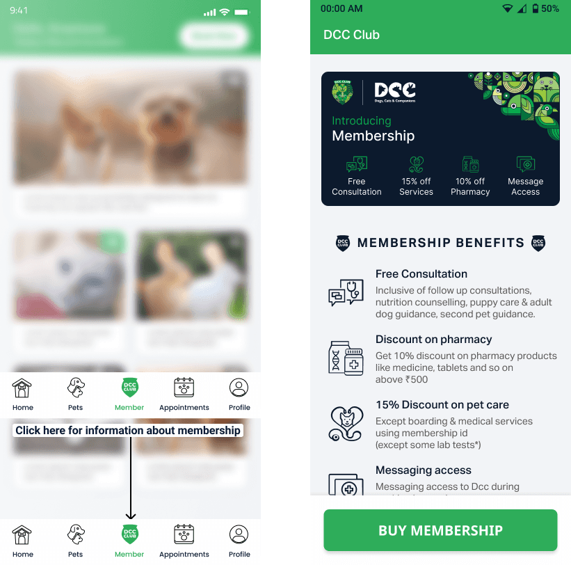
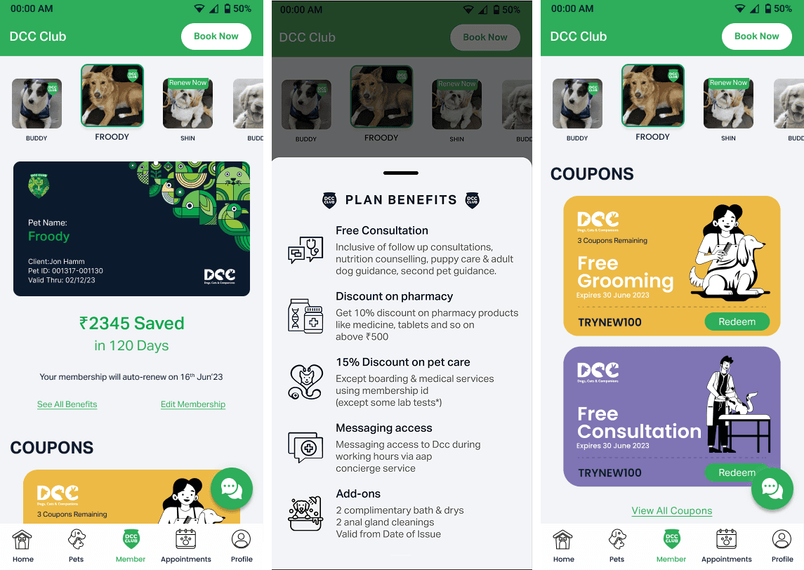
02. Membership Benefits Overview
An educational screen explaining:
Free vet consultations
Discounts on grooming, pharmacy
Real savings across all plans
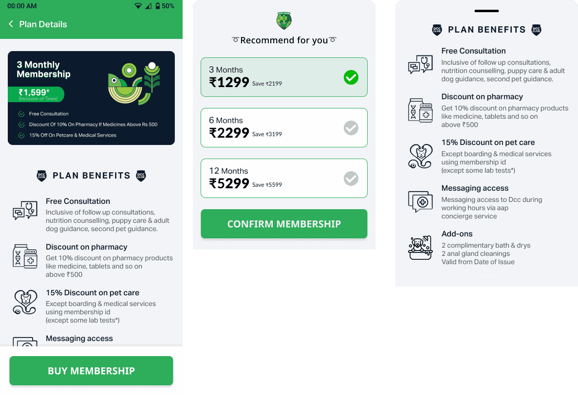
03. Plan Selection
Users choose from:
3 Months – ₹1299 Basic benefits package for new members
6 Months – ₹2299 Enhanced benefits with better value
12 Months – ₹3299Premium package with maximum savings
Savings are visually anchored to reinforce value.

The Experience Screen by Screen(Part 2)
04. Payment Confirmation
Once paid, the user is greeted with a warm confirmation and their pet's name on a welcome card.
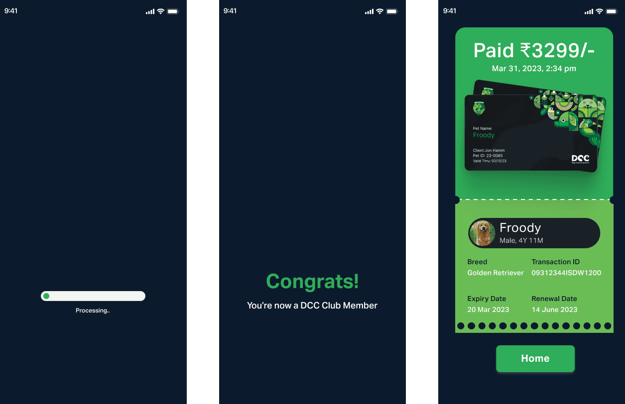
Click here to watch
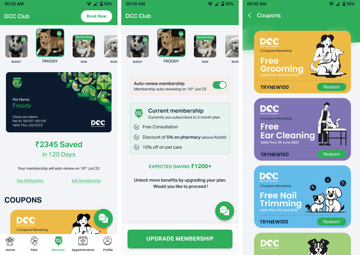
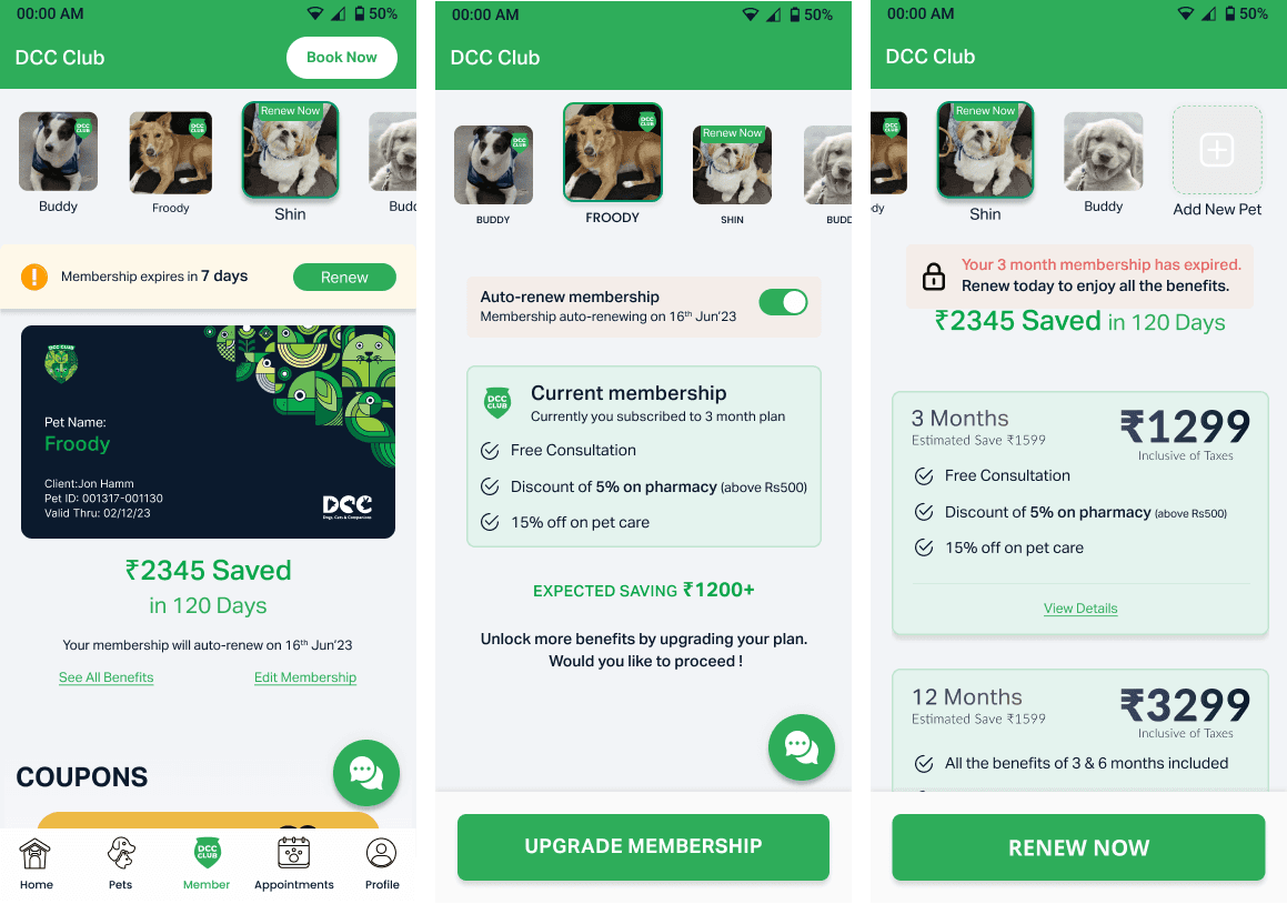
05. Membership Home
Active membership card
Pet's name, savings counter
Auto-renew toggle
CTA to redeem services
The Experience Screen by Screen(Part 3)
06. Coupon Details
Each coupon expands into a detailed screen with clear terms, a big redemption code, and a CTA.
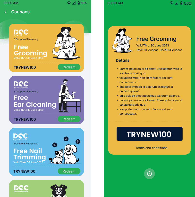
07. Expiry & Renewal
7-day reminder banners
Option to auto-renew or upgrade
Full comparison of plans
In-App Chat Support
We introduced an in-app chat line on the Membership Home Screen, allowing users to connect directly with a support advisor.
Chat Support for Members
Only visible for active members
Gets priority access to the DCC support team
Chat bubble floats on the home and coupon screens
Key UX Decisions
Visible chat bubble on the bottom-right of the Membership Home and Coupon List screens.
Support agents are pre-trained to assist only with membership-related issues, so the help is focused and contextual.
The Experience Screen by Screen(Part 4)
08. Chat Support for Members

Consider combining Post-Membership + Chat into one story-based section: “Once membership is activated, users land on a dashboard with quick access to redeem services, track savings, and ask for help via live chat.
Post-Membership Experience
Post-Membership Home
Card-style UI showing pet, plan, and savings
Quick links to redeem coupons
Dynamic "₹ Saved" tracker for motivation
Coupons List
Color-coded benefits
Clear CTA: Redeem Now
Status: Active / Used / Expired
Supporting States
I didn't just stop at the happy path I designed:
Loading States: Skeleton screens to reduce perceived wait time
Error Handling: Friendly messages + retry logic for backend failures
App Kill Recovery: Smart rehydration ensures users return to the exact screen/state
Loading States
Skeleton screens to reduce perceived wait time. Click Here To Preview
Error Handling
Friendly messages + retry logic for backend failures.
App Kill Recovery: Smart rehydration ensures users return to the exact screen/state
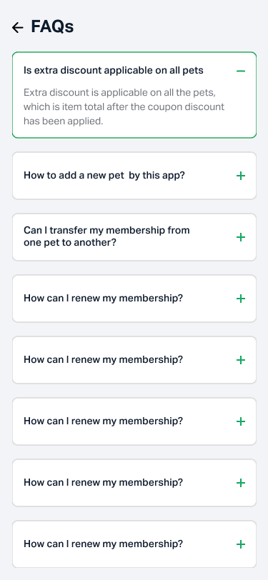
FAQs & Help
Accordion format with questions like:
Can I add another pet?
Is this transferable?
How do I redeem my bath & dry?
Testing & Outcomes
Outcome & Metrics
Usability Testing
Tested with 6 users on Figma prototypes.
We used Maze to run unmoderated usability testing.
Key Feedback:
Love seeing how much I saved!
Please call it grooming, not bath & dry.
The auto-renew toggle is helpful.
5/6 users said they felt more confident knowing they could talk to someone.
Users loved that they didn't need to search through Help or FAQS to find support.
No accidental chat triggers users only open it only when needed.
Final Thoughts
This wasn't just a UI exercise, it was a full-stack experience design, crafted from scratch. I was responsible for every step: research, wireframes, flows, UI, animation, handoff and design review after development.
This project wasn't just about adding a button. It was about turning a functional feature into a human experience.
I turned what could've been "just another subscription" into a DCC Membership, an experience for pet parents.
From zero to 43 thoughtful screens — the DCC Membership became a new pillar of the app.
Research & Discovery
Understanding user needs and business goals
Design System Creation
Building the foundation for consistent experiences
Screen Design & Prototyping
Crafting 43 screens with attention to every detail
Launch & Measurement
Tracking impact and gathering insights for future improvements
A complete journey—from idea → UX → launch Walk through the prototype
Ready to explore the DCC Club Membership experience for yourself?
👉 Get it on Google Play | Download on the App Store