Project detail
Designing the DCC Club Membership Experience from Scratch
Hi! I’m Nilesh, the sole product designer behind the brand-new DCC Club Membership experience, which is a complete feature launch built from the ground up inside the DCC mobile app. This case study captures how I designed a complete membership experience from scratch.


Project Overview
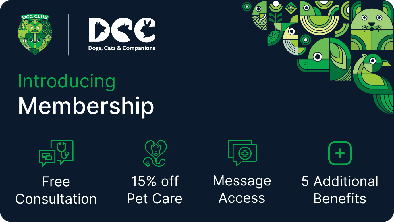
It was a full-stack design initiative that included 43 unique screens, a fresh design system, and rich Lottie animations all aimed at helping pet parents unlock recurring savings and care benefits through a tiered membership. Experience the design
My Role
As the only designer, I handled:
User research
Wireframes and flows
UI design
Created celebratory and micro-interaction animations using Lottie
Building the design system
Prototyping
Dev handoff and review cycles
Tools Used
Figma for design and prototyping
Lottie for animations
Vet360 SaaS for analytics and tracking
Timeline
October 2023 – March 2024
The Challenge
While the DCC app already had loyal users booking vet consults and grooming services, we noticed repeated user behaviour, people asking for frequent discounts or trying to negotiate packages.
We asked: What if we could turn that interest into a formal membership experience that rewards loyalty and builds retention?
Business Goal
Launch a completely new membership feature to:
Increase user retention and engagement
Boost app revenue through recurring plans
Make coupon redemption easier and trackable
Project Goals
Launch a 3-tier membership system inside the app
Educate users on the value of membership before purchase
Educate users on the value of membership before purchase
Ensure loading, error, and app-kill states are handled gracefully
Introduce in-app chat support for active members
Discovery & Research
Competitive Analysis
I studied membership experiences from:
Zomato Pro
Cult.fit
And some more brand memberships, but not technical ones
Heads Up For Tails
This helped identify best practices around tier visibility, redemption flows, and auto-renew nudges.
Core Benefits
Free consultations
Coupon redemptions
Discounted grooming & pharmacy
Auto-renew or manual renewal
In-app member-only chat for fast support
Understanding Our Users
To ensure the membership experience worked for real pet parents, I developed personas based on user interviews and survey data. Here are two representative users who guided key UX decisions:
Persona 2: Rajeev, The Value Hunter
Age: 38
Location: Jaipur
Profession: School Teacher
Pet: Indie dog named Shiro
Tech Comfort: Moderate (uses WhatsApp, YouTube, and Flipkart)
Membership Plan Chosen: 6-Month Mid-Tier
Behavior:
Shops carefully and compares prices before making decisions.
Look for offers on every booking.
Visits the vet at least once a month.
Pain Points:
I don’t always know what’s included in the membership.
Has limited trust in online platforms, often double-checks everything.
Goals:
Needs reassurance that his money is well spent.
Wants reminders and easy-to-use benefits without confusion.
How DCC Membership Solves for Sneha:
Visual layout of plans makes it easy to choose the right one.
Savings tracker builds emotional trust over time.
FAQs and coupon list reduce dependency on support calls.
Design System
To maintain consistency across 43+ screens, I created:
Button libraries (CTA, secondary, ghost)
Card modules for coupons
Membership plan comparison tables
Skeleton loaders and empty states
Animated assets via Lottie
Experience Design Flow
Plan Selection
Choose from 3-month, 6-month, 12-month plans
Estimated savings are shown dynamically
Auto-renew toggle option
Confirmation and Loading
Membership activated screen
Fun animation celebrates success
Skeleton loaders mimic final UI during wait times
The Experience Screen by Screen (Part 1)
Membership Entry Point
Added a centre CTA on Home with a pet-themed design, guiding users to explore membership.

Membership Benefits Overview
An educational screen explaining:
Free vet consultations
Discounts on grooming, pharmacy
Real savings across all plans

Plan Selection
Users choose from:
3 Months – ₹1299 Basic benefits package for new members
6 Months – ₹2299 Enhanced benefits with better value
12 Months – ₹3299Premium package with maximum savings
Savings are visually anchored to reinforce value.

The Experience Screen by Screen (Part 2)
Payment Confirmation
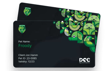
Once paid, the user is greeted with a warm confirmation and their pet's name on a welcome card.

Click here to view
Membership Home
Active membership card
Pet's name, savings counter
Auto-renew toggle
CTA to redeem services

The Experience Screen by Screen (Part 3)
Coupon Details
Each coupon expands into a detail screen with clear terms, a big redemption code, and CTA.

Expiry & Renewal
7-day reminder banners
Option to auto-renew or upgrade
Full comparison of plans

In-App Chat Support
We introduced an in-app chat line on the Membership Home Screen that allows users to directly connect with a support advisor.
Chat Support for Members
Only visible for active members
Gets priority access to the DCC support team
Chat bubble floats on the home and coupon screens
Key UX Decisions
Visible chat bubble on the bottom-right of the Membership Home and Coupon List screens.
Support agents are pre-trained to assist only with membership-related issues, so the help is focused and contextual.
The Experience Screen by Screen (Part 4)
Chat Support for Members

Consider combining Post-Membership + Chat into one story-based section: “Once membership is activated, users land on a dashboard with quick access to redeem services, track savings, and ask for help via live chat.
Post-Membership Experience

Post-Membership Home
Card-style UI showing pet, plan, and savings
Quick links to redeem coupons
Dynamic "₹ Saved" tracker for motivation
Coupons List
Color-coded benefits
Clear CTA: Redeem Now
Status: Active / Used / Expired
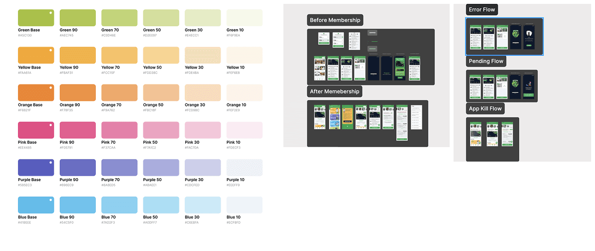
Supporting States
I didn't just stop at the happy path I designed:
Loading States: Skeleton screens to reduce perceived wait time
Error Handling: Friendly messages + retry logic for backend failures
App Kill Recovery: Smart rehydration ensures users return to the exact screen/state

Loading States
Skeleton screens to reduce perceived wait time. Click Here To Preview

Error Handling
Friendly messages + retry logic for backend failures.
App Kill Recovery: Smart rehydration ensures users return to the exact screen/state
Testing & Outcomes
Outcome & Metrics
28% ↑ in coupon redemption
36% ↑ in renewals
20% ↓ in support tickets
18 % ↓ drop in support tickets raised via external channels (email/calls).
40 % + of chat conversations resolved user queries in less than 3 mins.
Higher app usage time
Increased revenue through longer plans
Key Feedback:
Love seeing how much I saved!
Please call it grooming, not bath & dry.
The auto-renew toggle is helpful.
5/6 users said they felt more confident knowing they could talk to someone.
Users loved that they didn't need to search through Help or FAQS to find support.
No accidental chat triggers users only open it only when needed.
Usability Testing
Tested with 6 users on Figma prototypes.
We used Maze to run unmoderated usability testing.
Learnings & Final Thoughts
Wins
Emotional design wins. Showing how much the user saved (₹2345 saved in 120 days!) built instant trust.
Systems > Screens. A strong design system saved time and kept everything aligned.
Microinteractions matter. Lottie animations added delight, especially post-redemption.
Dynamic savings build trust
Lottie animations increase joy
In-app chat added human touch
Next Iterations
Benefit usage tracker
Personalized nudges
Seasonal coupon gamification
Final Thoughts
This wasn't just a UI exercise — it was a full-stack experience design, crafted from scratch. I was responsible for every step: research, wireframes, flows, UI, animation, handoff and design review after development.
This project wasn't just about adding a button. It was about turning a functional feature into a human experience.
I turned what could've been "just another subscription" into a DCC Membership, an experience for pet parents.
From zero to 43 thoughtful screens — the DCC Membership became a new pillar of the app.
Research & Discovery
Understanding user needs and business goals
Design System Creation
Building the foundation for consistent experiences
Screen Design & Prototyping
Crafting 43 screens with attention to every detail
Launch & Measurement
Tracking impact and gathering insights for future improvements
Tracking impact and gathering insights for future improvements
A complete journey—from idea → UX → launch Walk through the prototype
Ready to explore the DCC Club Membership experience for yourself?
👉 Get it on Google Play | Download on the App Store